Popular Woodworking 2008-08 № 170, страница 56
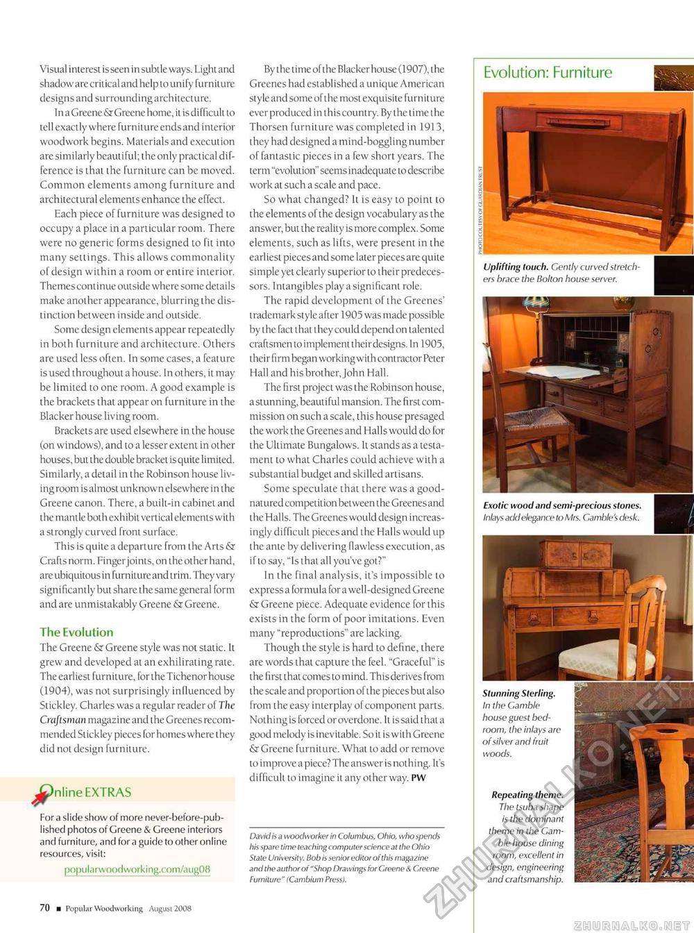
Visual interest is seen in subtle ways. Light and shadow are critical and help to unify furniture designs and surrounding architecture. In a Greene & Greene home, it is difficult to tell exactly where furniture endsand interior woodwork begins. Materials and execution are similarly beautiful; the only practical difference is that the furniture can be moved. Common elements among furniture and architectural elements enhance the effect. Each piece of furniture was designed to occupy a place in a particular room. There were no generic forms designed to fit into many settings. This allows commonality of design within a room or entire interior. Themes continue outside where some details make another appearance, blurring the distinction between inside and outside. Some design elements appear repeatedly in both furniture and architecture. Others are used less often. In some cases, a feature is used throughout a house. In others, it may be limited to one room. A good example is the brackets that appear on furniture in the Blacker house living room. Brackets are used elsewhere in the house (on windows), and to a lesser extent in other houses, but the double bracket is quite limited. Similarly, a detail in the Robinson house living room is almost unknown elsewhere in the Greene canon. There, a built-in cabinet and the mantle both exhibit vertical elements with a strongly curved front surface. This is quite a departure from the Arts & Crafts norm. Finger joints, on the other hand, are ubiquitous in furniture and trim. They vary significantly but share the same general form and are unmistakably Greene & Greene. The Evolution The Greene & Greene style was not static. It grew and developed at an exhilirating rate. The earliest furniture, for the Tichenor house (1904), was not surprisingly influenced by Stickley. Charles was a regular reader of The Craftsman magazine and the Greenes recommended Stickley pieces for homes where they did not design furniture. JP" For a slide show of more never-before-pub-lished photos of Greene & Greene interiors and furniture, and for a guide to other online popularwoodworking.com/aug08 By the time of the Blacker house (1907), the Greenes had established a unique American style and some of the most exquisite furniture ever produced in this country. By the time the Thorsen furniture was completed in 1913, they had designed a mind-boggling number of fantastic pieces in a few short years. The term "evolution" seems inadequate to describe work at such a scale and pace. So what changed? It is easy to point to the elements of the design vocabulary as the answer, but the reality is more complex. Some elements, such as lifts, were present in the earliest pieces and some later pieces are quite simple yet clearly superior to their predecessors. Intangibles play a significant role. The rapid development of the Greenes' trademark style after 1905 was made possible by the fact that they could depend on talented craftsmen to implement theirdesigns. In 1905, their firm began working with contractor Peter Hall and his brother, John Hall. The first project was the Robinson house, a stunning, beautiful mansion. The first commission on such a scale, this house presaged the work the Greenes and Halls would do for the Ultimate Bungalows. It stands as a testament to what Charles could achieve with a substantial budget and skilled artisans. Some speculate that there was a good-natured competition between the Greenes and the Halls. The Greenes would design increasingly difficult pieces and the Halls would up the ante by delivering flawless execution, as if to say, "Is that all you've got?" In the final analysis, it's impossible to express a formula for a well-designed Greene & Greene piece. Adequate evidence for this exists in the form of poor imitations. Even many "reproductions" are lacking. Though the style is hard to define, there are words that capture the feel. "Graceful" is the first that comes to mind. This derives from the scale and proportion of the pieces but also from the easy interplay of component parts. Nothing is forced or overdone. It is said that a good melody is inevitable. So it is with Greene & Greene furniture. What to add or remove to improve a piece? The answer is nothing. It's difficult to imagine it any other way. PW David is a woodworker in Columbus, Ohio, who spends his spare time teaching computer science at the Ohio State University. Bob is senior editor of this magazine and the author of ".Shop Drawings for Greene & Creene Furniture" ICambium Press). Evolution: Furniture Uplifting touch. Gently curved stretchers brace the Bolton house server. Stunning Sterling. In the Gamble house guest bedroom, the inlays of silver and fruit woods. Repeating theme. The tsuba shape is the dominant theme in the Gamble house dining room, excellent in design, engineering and craftsmanship. 70 ■ Popular Woodworking August 2008 |


