Popular Woodworking 2009-06 № 176, страница 50
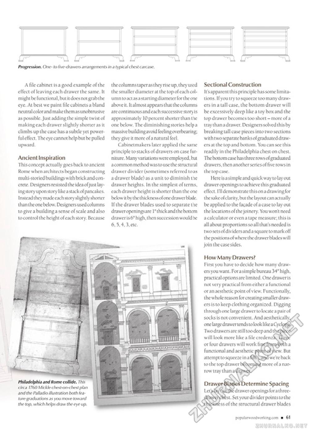
^U U- CPL F ». One- to fiw-dr*>vt> jfungentenh in J typkalihnt care ax-. A file cabinet isa good example of the effect of leaving each drawer the same. It mighi be functional, bum docs not grab the eye. At best we paint file cabinets a bland neutral color and make them as unobtmsive as possible. Just addingthe simple twist of making each drawer slightly shorter as it climbs up the case has a subtle yet powerful effect. The eye cannot help but be pulled Ancient Inspiration This concept actually goes back to ancient Rome when architects began constructing multi-storied buildings withbrkkandconcrete. Designers resisted the idea ofjust lay-ingstory upon story like a stack of pancakes. Instead the)- made each story slightly shorter than the one below. Designers used columns to give a building a sense of scale and also to control the height of each story. Because the columns taperas they nse up. the>'used the smaller diameter at the top of each column toact asa staningdiameter for the one above it. It almost appears that tlie columns are continuous and each successive story 15 approximately 10 percent shorter than IV one below. The diminishing stories help a massive building avoid feeling overbearing; they give it more of a natural feel. Cabinetmakers later applied the sane principle to stacks of drawers on case furniture. Many variat ions were employed, hit a common method wostouse the structural drawxr divider (sometimes referred toas a drawer blade) as a unit to diminish tie drawer heights. In the simplest of terms, each drawer height is shorter than the one below it by l he I h ickness of one d rawer Hade If the drawer blades used to separate tie drawer opemngsare I'thickandihehoitem drawer is6' high, thensuccession would be 6.5.4.3.etc. Sectional Construction It's apparent this principle has some limitations. Ifyou try to squeeze too many draw-crs in a tall case, the bottom drawer will be excessively deep like a toy box and the top drawer becomes loo short - more of a tray thanadrawer. Designers solved thisby breaking tall case pieces into two sections with two separate banksof graduated drawers at 1 Ik- top and bottom. You can see this readily in the Philadelphia chest on chest. The bottom case hasihnv rows of graduated drawers, then another series of five rows in Here is a si mple and qu k k way to lay out drawer openings to achtcvc this graduated effect. Ill demonstrate thison adrawinglbr the sake of clarity, but the layout can actually be appl ied to the facade of a case to lay out the locanonsof the joinery. You wont need a calculator or even a tape measure; this is all about proportionssoallthat'sneeded is two sets of dividers and a square to mark off the posit lonsofwhere thedrawer blades will join the case sides. I low Many Drawers? First you have to decide how many drawers you want. For a simple bureau 34' high, practtcaloptionsare limited. One drawerts not very practkal from either a functional or an aesthetic point of view. Functionally, the whole reason for creatingsmalkr drawers is to keep clothing organized Digging through one large drawer to kx ate a pair of socks Is not convenknt. And aesthetkally. one large drawer tends to kvok like a Cyclops. Two drawers are stil I too deep and t he piece will look more like a file credenza. Three or four drawers will work fine from both a functional and aesthetic point of view. But attempt tosqueeze in a fifth, and we're back to the top drawer becoming more of a narrow tray than a drawer. Drawer Blades Determine Spacing Lct'slay out the draweropenings fc>ra three-drawer chest. Set your divider points to the thickness of the structural drawer blades |


